Evaluation
Today we went to watch the college Fashion Show at 2:00-3:00 in the afternoon. The designs were unique and interesting and though a lot of them were actually really pretty and designed well. They suited the category's which they were placed in. I think the models were good at keeping in time with the music provided however sometimes they looked quite uncomfortable and made the atmosphere awkward especially when the music sometimes went quiet and the models had nothing to walk on to. I think overall the fashion show was good and interesting to see.
Thursday, 27 June 2013

Tuesday, 21 May 2013
Sister Corita
Rachel Tighe Unit 5 Contextual Influences
Sister Corita’s work was very vibrant, bright and unique, using quick ‘splashes’ of colour and consisted of several hundred serigraph designs which were used for book covers murals and poster designs. Her earliest work featured phrases and imagery from the Bible which made her beliefs well known through her work. Her unique and distinctive style helped to bring silk screening and serigraph into the world of fine art design.
Sister Corita began in the Roman Catholic order of the ‘Sisters of the Immaculate Heart of Mary’ in LA after she had finished high school. Here she became Sister Mary Corita and earned her BA in 1941 and later became chairman of its art department. During semesters, Sister Corita and her students would work hard to create new serigraph designs for her art. She then went on to colleges of art and design and then at the University of Southern California where she studied the history of art and received a masters degree. She left the Immaculate Heart college in 1968 to move to Boston, where she then devoted her life to creating her art and imagery and created over 400 serigraph images throughout the next 18 years. She began focusing on a lot of floral silk screens which dominated her work for a while. She still created posters and billboards for company’s and social events, but eventually died from cancer in 1986, age 67.
I think that Sister Corita’s work is very bright and eye catching to it’s audience which relates well with her view on hope, peace and beliefs. It is as though she makes her work important looking through her colours so that she gets a message across and shows how strong her beliefs are. I like the way her work looks slightly messy in the way it is presented, but this just seems to make it look more creative and relatable to the artist. The way she creates her imagery and art is very precisely chosen and I think that this is good because it means that she has one method which she is most comfortable with and can use as much as possible, and yet she still experiments with other things, objects, media and phrases or slogans. I hope to use her ideas and media within my own work.
http://en.wikipedia.org/wiki/Corita_Kent
https://www.corita.org/coritadb/index.php?id=5&option=com_content&task=view
Sister Corita’s work was very vibrant, bright and unique, using quick ‘splashes’ of colour and consisted of several hundred serigraph designs which were used for book covers murals and poster designs. Her earliest work featured phrases and imagery from the Bible which made her beliefs well known through her work. Her unique and distinctive style helped to bring silk screening and serigraph into the world of fine art design.
Sister Corita began in the Roman Catholic order of the ‘Sisters of the Immaculate Heart of Mary’ in LA after she had finished high school. Here she became Sister Mary Corita and earned her BA in 1941 and later became chairman of its art department. During semesters, Sister Corita and her students would work hard to create new serigraph designs for her art. She then went on to colleges of art and design and then at the University of Southern California where she studied the history of art and received a masters degree. She left the Immaculate Heart college in 1968 to move to Boston, where she then devoted her life to creating her art and imagery and created over 400 serigraph images throughout the next 18 years. She began focusing on a lot of floral silk screens which dominated her work for a while. She still created posters and billboards for company’s and social events, but eventually died from cancer in 1986, age 67.
I think that Sister Corita’s work is very bright and eye catching to it’s audience which relates well with her view on hope, peace and beliefs. It is as though she makes her work important looking through her colours so that she gets a message across and shows how strong her beliefs are. I like the way her work looks slightly messy in the way it is presented, but this just seems to make it look more creative and relatable to the artist. The way she creates her imagery and art is very precisely chosen and I think that this is good because it means that she has one method which she is most comfortable with and can use as much as possible, and yet she still experiments with other things, objects, media and phrases or slogans. I hope to use her ideas and media within my own work.
http://en.wikipedia.org/wiki/Corita_Kent
https://www.corita.org/coritadb/index.php?id=5&option=com_content&task=view
Sunday, 5 May 2013
Tablet drawings: Back of church

Tablet drawings: Building 2

Tablet drawings: Building 1
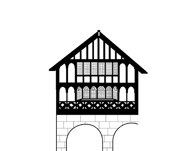
Tablet drawings: Church door

Tuesday, 5 March 2013
Life Drawing


Today I began to draw full body life drawing and at first found it difficult. I felt that it was hard to decide where to start without any guidence,however once I started I was able to understand how proportions of the body should be drawn and to keep looking at the model so that I did not draw the body from memory. For the first two drawings I used newsprint, for the third I used brown paper and for the fourth I used cartridge paper. For the last two images I drew three body shapes on bht pieces of paper which ended up over lapping. In the end this looked diliberate which made it look particularly good. I used charcoal to draw each of my images and found this easier as I could make thicker and thinner strokes where I wanted to and go over parts which I didn't like.


Tuesday, 26 February 2013
Jenny Saville recreation image

Thursday, 17 January 2013
Life Drawing - Hands

These were the drawings I did of hands when looking at life drawing. I drew each of them with a graphite stick and found them much more difficult than drawing feet. I found the shape of the fingers particularly hard to get right. However I found certain angles interesting to draw and it helped to develop my skills.


Life Drawing - Feet

These are the drawings of feet I did when looking at life drawing. They were each done in charcoal apart from the bottom picture which was done with a graphite stick. I found them quite difficult when drawing the feet at certain angles, especially from the front, but overall i found them to be easier than drawing hands as there were less small shapes involved. I also tried to add slight detail and shadow to my images.


Tuesday, 15 January 2013
Jenny Saville
Jenny Saville, born in 1970, is a contemporary British painter. She is known for her large-scale paintings of naked women. Saville works and lives in Oxford, England. By 1994, many people were familiar with Jenny Saville's massive paintings. She has recently broken into the contemporary art world with the help of gallery
owner and art collector Charles Saatchi. I think her work is an interesting way of looking at the human body, i.e how she sometimes paints the skin right up against a flat surface to give it effect. I think this is quite unique and makes her work recognisable to her. It shows she is not afraid to try new things and experiment with her work and also the colours involved. She often uses various skin tones but also adds blues and reds to make them more interesting and original.
Friday, 21 December 2012
Counterfeiting in Fashion
Imitation and counterfeiting have always been issues to discuss about in the fashion industry. Chanel thought of imitation as a consistent measurement method of a brand’s success, saying that the more you were imitated, the more you succeeded in fashion.
Sunday, 9 December 2012
Cyril Edward

Cyril Edward
Cyril Edward Power was born in Chelsea on 17 December 1872.
During the early 1920s, he was producing watercolour landscapes and townscape.
In 1930 Power was elected member of the Royal Society of British Artists and established a studio with Andrews in Hammersmith close to the River Thames, a location which inspired many prints by both artists. During the last year of his life Power completed some eighty-nine oil paintings, a format he had grown increasingly fond of in the preceding years. These were mainly landscapes of the surrounding areas, often Helford River and the Falmouth area of Cornwall as well as some floral studies. He died in London in May 1951, aged seventy-eight. His work consists of curved lines which are well created in his lino printing. His work is often colourful and interesting to the viewer. I think his work inspires me because of the various colours he uses on his lino printing which is something I would like to try and become better at doing.
Cyril Edward Power was born in Chelsea on 17 December 1872.
During the early 1920s, he was producing watercolour landscapes and townscape.
In 1930 Power was elected member of the Royal Society of British Artists and established a studio with Andrews in Hammersmith close to the River Thames, a location which inspired many prints by both artists. During the last year of his life Power completed some eighty-nine oil paintings, a format he had grown increasingly fond of in the preceding years. These were mainly landscapes of the surrounding areas, often Helford River and the Falmouth area of Cornwall as well as some floral studies. He died in London in May 1951, aged seventy-eight. His work consists of curved lines which are well created in his lino printing. His work is often colourful and interesting to the viewer. I think his work inspires me because of the various colours he uses on his lino printing which is something I would like to try and become better at doing.
Pablo Picasso

Born 25th of October, 1881, was a Spanish print maker, painter and sculptor and spent most of his life in France. He was one of the most influential artists of the 20th Century, he co-founded the Cubist movement.
Picasso’s work is often categorized into certain periods. The most commonly accepted periods in his work are the Blue Period (1901–1904), the Rose Period (1905–1907), the African-influenced Period (1908–1909), Analytic Cubism (1909–1912), and Synthetic Cubism (1912–1919).
I enjoy his work as it has a lot of creative imagery involved. For example many of his pieces consist of various shapes and boldy coloured images which are eye catching and intriguing. It is also not always easy to tell what is in the image, therefore showing how much imagination has been put into it.
Thursday, 22 November 2012
Raoul Hausmann
Raoul Hausmann is an Austrian artist who focused in the Dada era. He often focuses on photographic collages. he was born in 1886. He was a photomonteur, painter, fashion designer, poet, pamphleteer, publisher, and partner of Hannah Hoch. Everything he did was done with enthusiasm and an often angry gallows humour.
His work consists of collage and mixed media which i find interesting because of the random designs. his work is not colourful, yet it is easy to connect with his audience through them.
His work consists of collage and mixed media which i find interesting because of the random designs. his work is not colourful, yet it is easy to connect with his audience through them.
Varvara Stepanova

Man Ray

his work is extremely unique and often focus on people. His images are often very surreal and odd, but tis intrigues the eye. They often feature a black and white colour scheme. I think this makes his work more recognizable.
Dave mckean
David McKean was born 29 December
1963 and is an English illustrator, photographer, comic book artist, graphic
designer, filmmaker and musician.
His work incorporates drawing,
painting, photography, collage, found objects, digital art and sculpture. After
a trip to New York in 1986 during which he failed to find work as a comics
artist, McKean met writer Neil Gaiman, and
the pair collaborated on a short graphic novel of disturbing childhood
memories. In 1989, he illustrated the Batman graphic novel, Arkham
Asylum. He also illustrated many childrens
books.
I think that his work is very unique as the images are unpredictable and sometimes it is hard to tell what is actually in the image or what McKean is trying to tell us. His images are surreal and charasmatic and more often than not present the faces of people. I think that each of his images are supposed to bring a story to the viewers mind, and even though they are unclear it is very interesting to try and pick McKean’s pieces apart.
I think that his work is very unique as the images are unpredictable and sometimes it is hard to tell what is actually in the image or what McKean is trying to tell us. His images are surreal and charasmatic and more often than not present the faces of people. I think that each of his images are supposed to bring a story to the viewers mind, and even though they are unclear it is very interesting to try and pick McKean’s pieces apart.
Peter Blake
Sir Peter Thomas Blake was
born on the 25th June 1932. He is an English pop artist and was also knighted three
years ago. He
has produced collage, sculpture, engraving and printmaking, commercial art and
various album covers, i.e. The Beatles. Blake studied at Gravesend School of
Art before being accepted into the Royal College of Art in London. He was
influenced by American realist artists.
‘On the Balcony ‘ is an early work and still stands as one of the iconic pieces of British Pop Art, showing Blake's interest in images from pop culture with fine art. It appears to be a collage but is in fact painted. It is inspired by other paintings and features other artists work.
‘On the Balcony ‘ is an early work and still stands as one of the iconic pieces of British Pop Art, showing Blake's interest in images from pop culture with fine art. It appears to be a collage but is in fact painted. It is inspired by other paintings and features other artists work.
I think that Blake’s work is bright and eye catching which helps the
viewer to recognise his work. It is simplistic yet unique as it has little
detail however a lot of his pieces relate to music and have a vintage feel to
them which makes each piece more intriguing.
Robert Rauschenberg
•He
was an American painted and a graphic artist who was well known for his
‘combines’ of the 1960’s. This was a combination of both painting and sculpture
but sometimes he would also work with photography. He created the ‘black
painting’ which incorporated little bits of newspaper into his work. Eventually
he began using different types of material i.e. wood and nails…
I think the fact that Rauschenberg incorporates different materials is interesting and original. This shows that different media can be put into images and it wont look messy or odd, it actually makes the images more colourful and fun.
I think the fact that Rauschenberg incorporates different materials is interesting and original. This shows that different media can be put into images and it wont look messy or odd, it actually makes the images more colourful and fun.
Subscribe to:
Posts (Atom)